
Upstairs/Downstairs
For the last few months we have been imagining this beautiful new 0-3 space right front and center by the entrance. But lately I have really been torn on if this is the best location. This seed of doubt started after visiting PlaySpace at Boston Children’s Museum. It is tucked away far from the main entrance. What we noticed was that this created much more of a sanctuary feel. This space was quieter and more private than any other exhibit space. And for this audience, this is a huge benefit.
So we started to think, “What if we moved this up to the second floor?” For every pro for the space there is a con as well, so I’ve gone and made a good ol’ fashioned pro and con list.
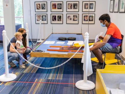
Pro of being on the 1st floor: This space would be remarkably accessible and available to families with very young children. It would be a short and straight path from the admissions desk. The majority of our visitors have a child with them 0-3, so this would be a convenience for many of our families. It would better integrate the “children’s” and “science” exhibits, welcoming a family audience throughout the museum. This space would share a wall with our water exhibit, which would make it easier for us to have water features within the 0-3 room that would be appropriate for this age.
Con of being on the 1st floor: The museum caters to children 0-12, so for anyone visiting with a child 4 or older, they are walking into a great big beautiful museum and essentially having a “do not enter” sign in front of them. And speaking of having a great big beautiful museum, we want people to see it and know about it. If we have families develop a visitation pattern of just going from the front desk to the exhibit that is right in front of them, they won’t walk by any of the other amazing experiences that they could be interested in. The majority of exhibits are on the 2nd floor as the 1st floor includes an eating area, the front desk and gift shop, and program spaces. This means that for families that have a younger and older child with them, there are limited spaces on the 1st floor for the older child that are in line of site from this exhibit. And given the slope of the building, this exhibit space would have no windows and would rely on overhead lighting, and trying to get as much natural ambient light in from the rest of the museum.
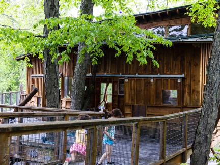
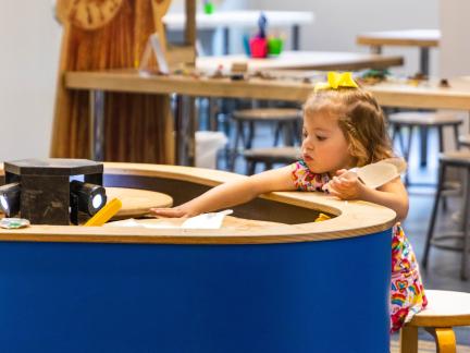
Pro of being on the 2nd floor: This is prime space for whatever exhibit ends up here. The front SW corner of the building will have lots of windows and natural light, along with a great view looking down across the new outdoor space and amphitheater. There will be stairs and a new glass elevator right at the entrance to take you directly to this space. From within this space you could see across the 2nd floor which contains many exhibits for older and younger children; including our maker/tinkering space that older children can spend hours at. As planned at the moment, this exhibit would also be next to several exhibits designed for our visitors 0-6 inspired by our current Children’s Discovery Museum. The ceiling will be vaulted, giving a significant amount of vertical space to work with.
Con of being on the 2nd floor: Although easy to get to, it is more work to get to the 2nd floor particularly when loaded with a heavy diaper bag and a toddler or two. And sure the high ceilings are nice, but we are designing for young children, trying to make spaces that feel small and intimate. Locating this exhibit next to the other exhibits specifically for younger children could divide up how our visitors use the museum – “Don’t go on that side of the floor, it is for babies,” or “All the big kids are over there, so let’s avoid it.”
What do you think, where should this exhibit go? We have a small window of time here where we have the opportunity to make changes fairly easily. I definitely have a preference at the moment, but I’ll hold onto it for a moment… Thoughts?

Comments
Add new comment